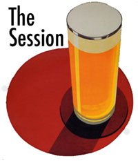
 Jay Brooks has created a logo for The Session. He’s even given us multiple options – both to the size you use and also if you want to include the words “Beer Blogging Friday.”
I haven’t decided which I prefer, so don’t be surprised if you come back and words magically appear in the red circle.
You can grab what you want here.
We all owe Jay a beer (each). Jay, I’ll buy you one at Stubbs in Austin, OK?
Nice. Might I suggest the title be flush right – sort of bracketing the the glass?
Just my graphics side showing.
It’s always something … Okay, I’ve added a version with the text justified right.
Kewl! I’m not a bad A.D., am I? 😉
While we’re at it, maybe we can change the font, switch to an Alt Bier, maybe get that red a little more to the PMS-185 side… ;-D
I made a few adjustments which I think really work well.
Alan. I like the idea of folks taking the logo and making it their own.
With the aside that I hope Jay does as well, since he went to the trouble.
Let the wine bloggers be sheep and all use the same logo. We’re beer drinkers. We’re leaders.
I made a few adjustments which I think really work well.
Okay, but now the readability gets a bit skewed and I’m not so sure the initial cap to lower case jump is working for me…
😉
OK, it works for me. I was having a hard time incorporating crayon into the digital world but this kinda does that. I could not figure out how to leave a stain on it, though. MS Paint does not have a beer glass stain function. I really have issues with Bill Gates.
I was having a hard time incorporating crayon into the digital world but this kinda does that.
It’s always so difficult cleaning the monitor of Crayola with rubber cement thinner.
(how did this turn into the graphics-bash-blog? ;-))