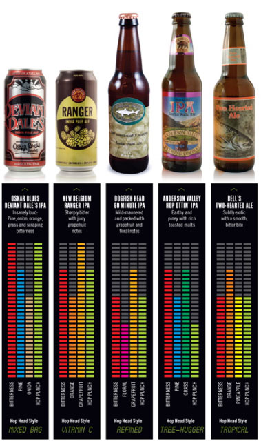
Does this illustration courtesy of DRAFT magazine1 make you think about beer aroma and flavor any differently? Particularly hops? The point is not whether you find grapefruit more prominent in New Belgium’s Ranger IPA or Dogfish Head 60 Minute IPA or if you agree that Anderson Valley Hop Ottin’ IPA has more bitterness than Bell’s Two-Hearted Ale but less hop punch.
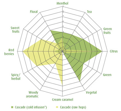
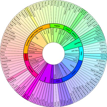
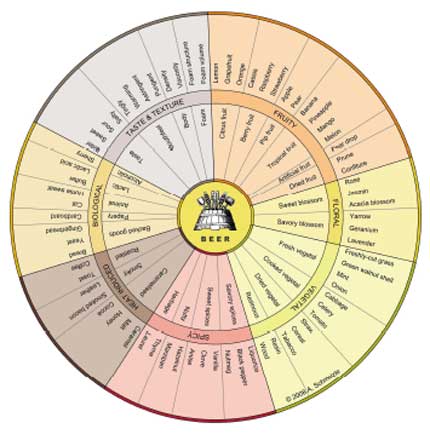
I like it because the colored meters make it easy to think in terms of volume (synonym: impact) as well as the way the aroma components fit together. This is different than spider graphs (here are a couple more examples beyond the one that follows), so brilliant that I take back everything nasty I said when DRAFT used the antiquated tongue map as an illustration in its early issues.

This spider chart appears in The Hop Aroma Compendium compiled by Joh. Barth & Sohn. The tan portion indicates how two beer sommeliers and a perfumist perceived the aroma of raw Cascade hops, while the green shows how that changed in a cold infusion (similar to dry hopping).
These work best if you are willing to accept, perhaps even embrace, a certain amount of ambiguity. Members of tasting panels at breweries are trained to identify X or Y as this or that aroma or flavor. That’s so their brewers can make beer with a certain level of consistency. (See New Beer Rule #4.) Drinking, and enjoying, beer can be altogether different, and it might be best not to get too specific when trying to pick out particular aromas or flavors. In How to Love Wine author Eric Asimov devotes an entire chapter to “The Tyranny of the Tasting Note.” It’s a topic he’s addressed before, and tends to get wine writers pretty riled up. He makes excellent points, but also some I’m not sure I agree with. Probably something better examined in a separate post (maybe even the next one). But a key takeaway is that when somebody starts describing “aromas of apricot, jam, guava, and jackfruit” that there’s little chance another drinker will get then that tasting note is not only useless, but discouraging.
These visual representations are much friendlier. Both managing editor Jessica Daynor and beer editor Chris Staten provided details via email about the illustration in DRAFT.
“. . . there’s no formal data behind the sensory ratings — just our ratings of each flavor element from 1 to 5 (that number was multiplied by 6 in design, which is how we got the final artwork you see in print),” Daynor wrote. “We feel that part of our job as editors is to present beer to readers in as many digestible ways as possible, and particularly for people new to beer, sometimes, it’s more practical to make sense of flavor elements visually, which is what we did here. It’s so easy to make generalized statements about IPAs: ‘They’re really bitter;’ ‘They’re hoppy;’ etc., but what does that actually mean? And if that’s the case, then aren’t all IPAs the same? With that piece, we’re trying to show that even among the most common IPAs on shelves, there are many flavor nuances that make each beer unique.”
Staten added: “I’ve always been intrigued with the path beer drinkers take when they’re first exploring the world of hops. Often, I run into newer drinkers who say they love IPAs but can’t figure out why particular IPAs rub them the wrong way — lot’s of the time it’s because they aren’t focusing enough on the flavor profile to discover likes and dislikes. The piece was just a casual way to let these particular readers know that there’s a wide range of hop flavors, and a wide range of flavor combinations/perceived bitterness/etc. from IPA to IPA.”
A casual way. I like that.
*****
1 The November/December issue (“Top 25 Beers of the Year” cover).
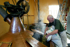 The editors at Slate used this photo to illustrate a provocative story headlined “Against Hoppy Beer: The craft beer industry’s love affair with hops is alienating people who don’t like bitter brews.” 1 In the picture, Jean-Pierre Van Roy is adding hops to a brew kettle at the Cantillon brewery in Brussels. The choice is amusing because Van Roy has aged the hops so they are not bitter.2